


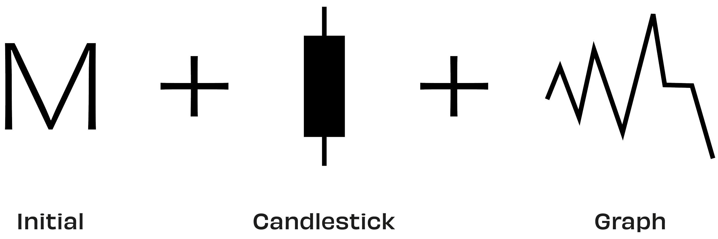
Visualising value with a single letter
The logo was carefully crafted to form the letter "M" while subtly incorporating key visual elements associated with trading. The design references candlesticks, a fundamental tool on trading charts. Additionally, the structure of the logo subtly mimics the appearance of a graph, reinforcing the brand’s connection to market trends and financial growth. Beyond its direct trading references, the logo’s form also alludes to the double top pattern, a significant technical indicator in trading. This pattern signals a bearish market reversal when an asset reaches a high price twice, with a moderate decline in between, before breaking below a key support level. The design also incorporates higher lows, a concept that reflects upward market momentum and resilience, aligning with the brand’s strategic vision.
Market Blueprint Simplified
A bold brand identity that embodies the strategy, modernity, and impact of trading.
For this project, I developed a comprehensive brand identity and digital product guide for a trader, with the goal of creating an identity that resonated with a diverse audience across various age groups, while maintaining a clean and professional aesthetic.
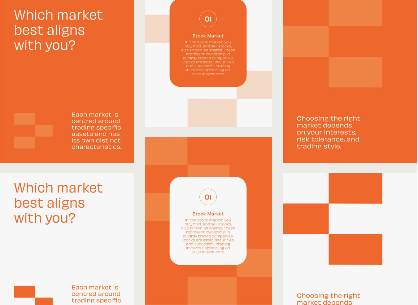
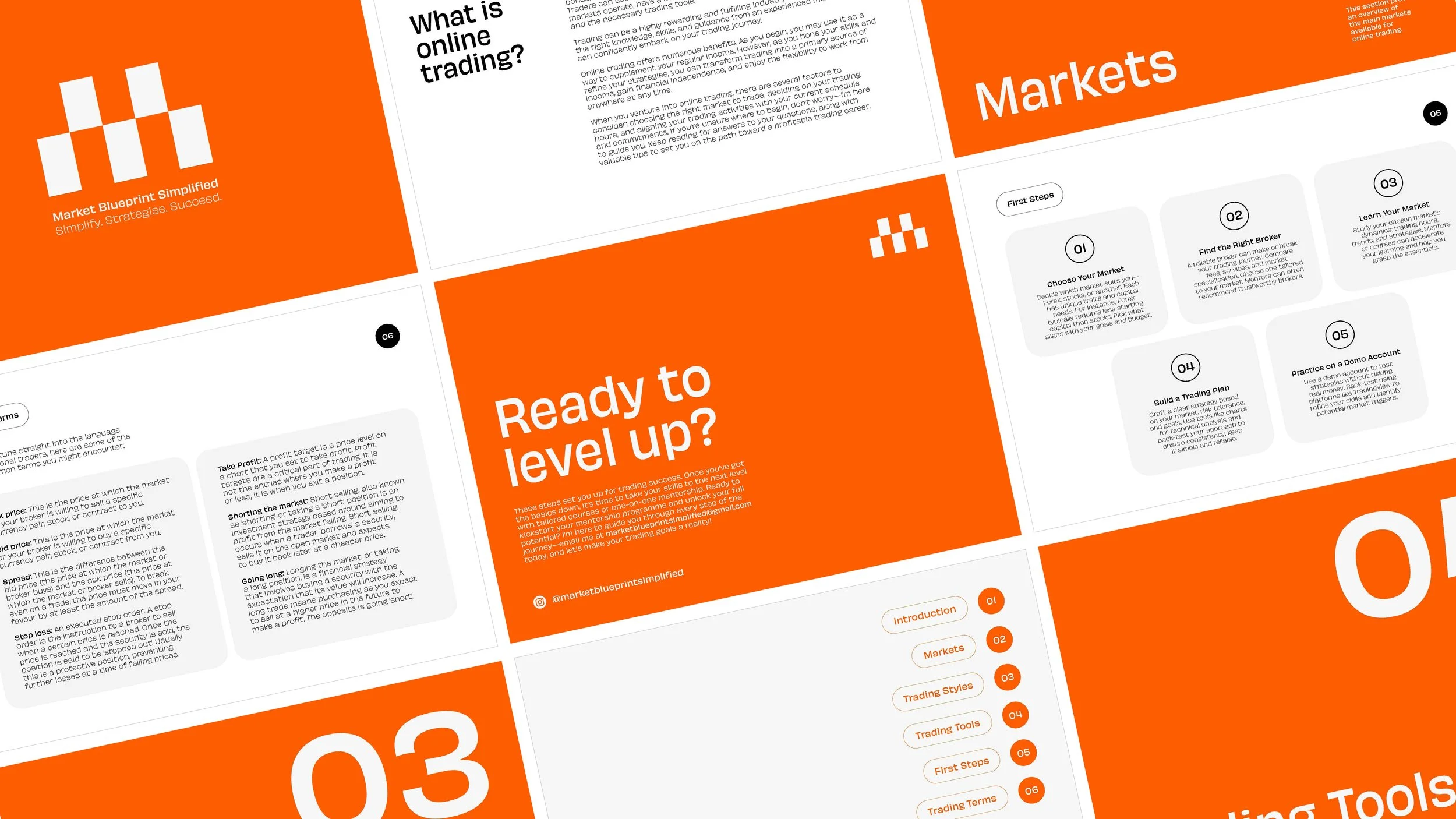
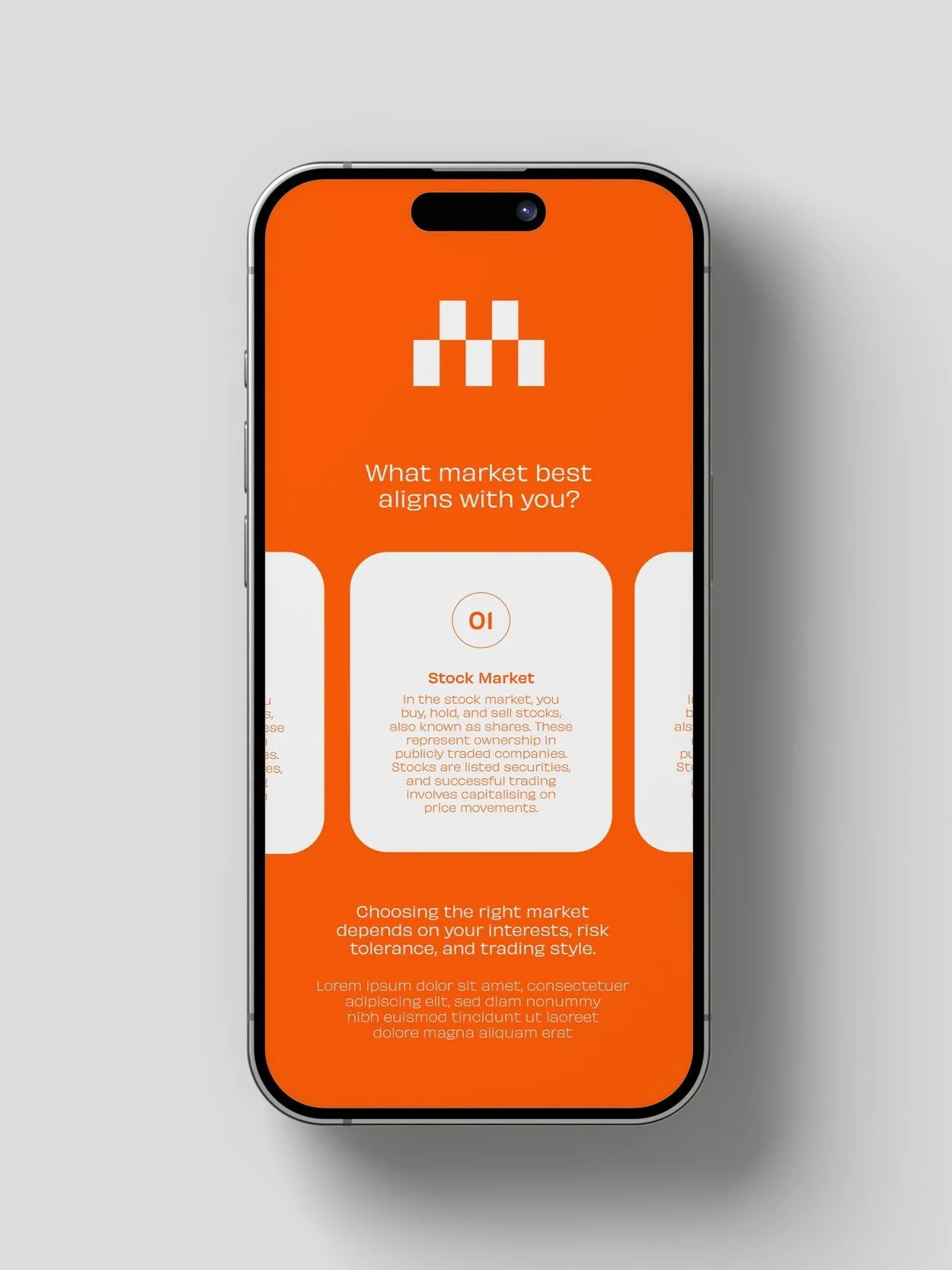
In addition to the branding, I designed a digital product guide to support the trading mentor in introducing fundamental concepts ahead of one-to-one mentorship sessions. This resource was crafted to provide clarity and structure, ensuring a seamless and engaging learning experience for users. By combining strong conceptual foundations with a refined visual style, the branding effectively captures the analytical nature of trading while presenting a modern, approachable presence.
To download the guide click here.
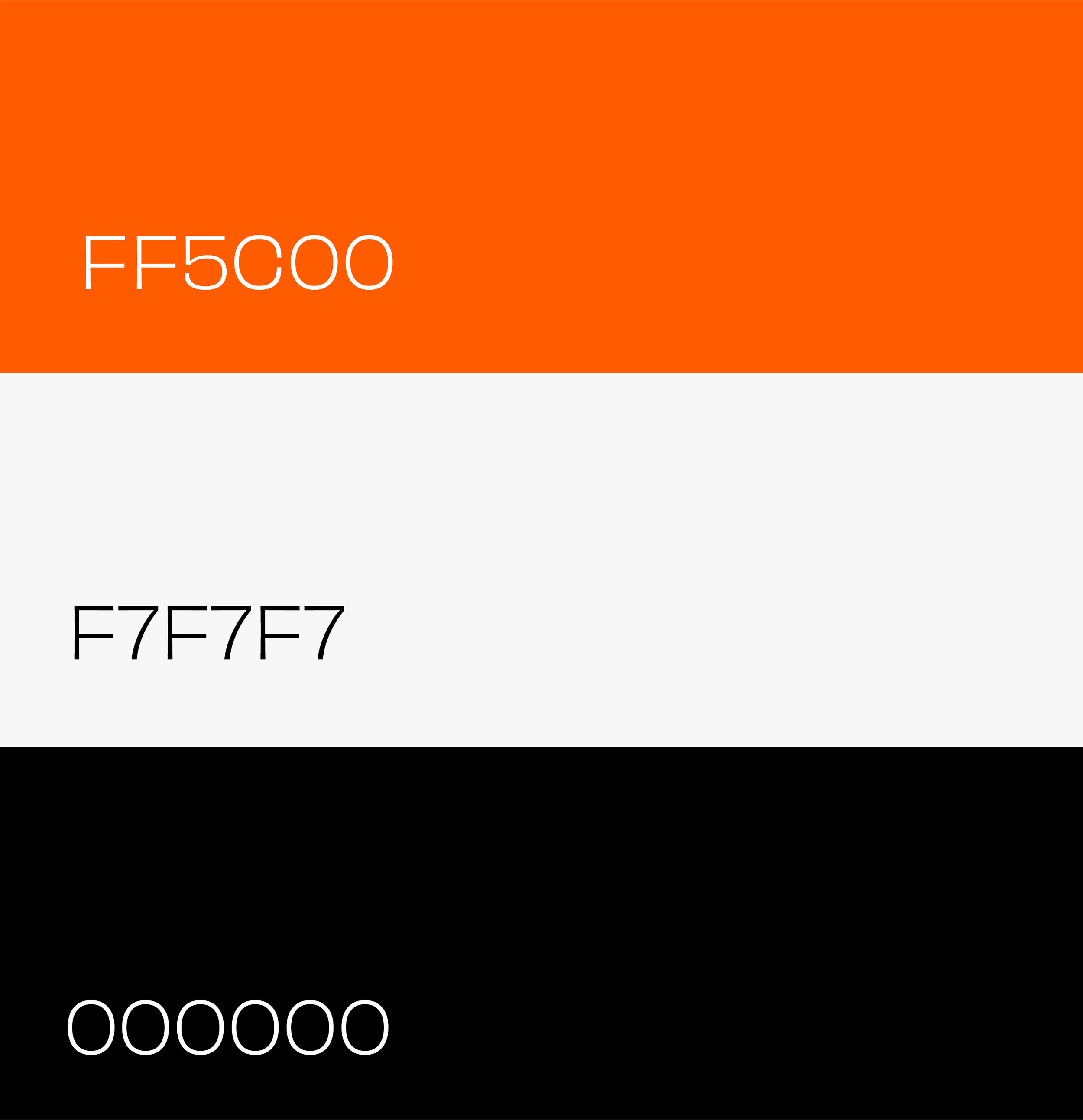

Trading in colour
The colour scheme was intentionally stripped back to black, off-white, and orange, creating a sophisticated yet bold visual identity. Each colour was selected for its relevance to the world of trading. Black conveys professionalism, authority, and stability, qualities essential in the financial sector. Off-white introduces a sense of clarity, balance, and modernity, ensuring a clean and minimalistic aesthetic. Orange is a strategic accent colour, symbolising energy, action, and optimism, while also subtly referencing the colours often used in trading charts to indicate bullish movement.

Working with Hannah was an absolute breeze. She brought a rare balance of creativity and strategic structure to the project, helping us shape a clear, compelling blueprint for the MBS trading brand. From the outset, she fully understood our vision of making trading accessible to beginners and translated that into clean, intuitive design work that genuinely connects with the target audience.
Her communication was seamless, her turnaround times were impressive, and the entire collaboration felt smooth and effortless from start to finish. What truly sets Hannah apart is her exceptional attention to detail and her ability to actively listen - she takes the time to understand client needs deeply and then executes with precision and care.
I’d strongly recommend working with her to anyone looking for a designer who not only delivers high quality work but also elevates the entire creative process.
— Taiwo Daramola, Founder of Market Blueprint Simplified