Brand identity | Visual strategy
I had the opportunity to develop the brand identity for PS Talent Consulting, a recruitment firm focused on building meaningful connections between clients and candidates.
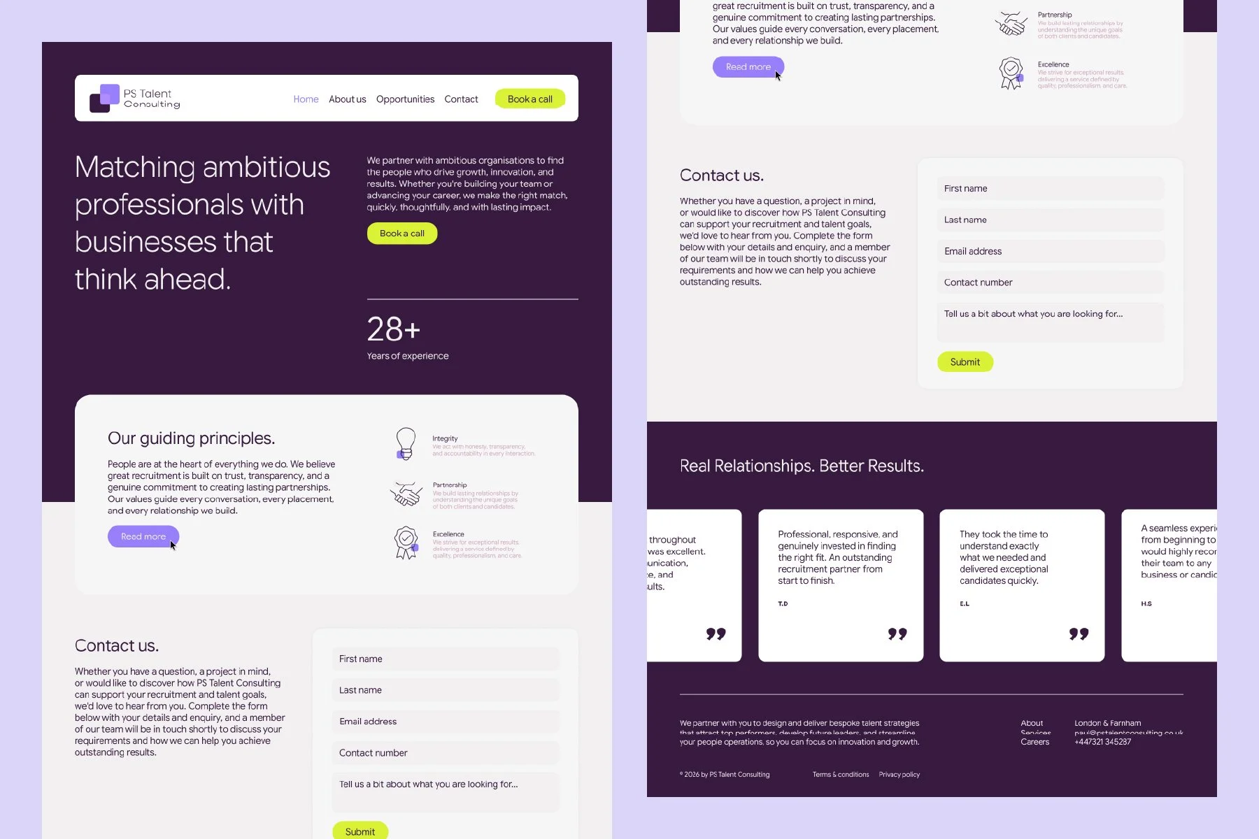
The aim was to create a brand that feels clear, credible, and forward-thinking, something that stands apart in a competitive industry often defined by generic visual language. The identity needed to reflect not just recruitment, but the idea of long-term partnerships and growth.
PS Talent Consulting

Overview
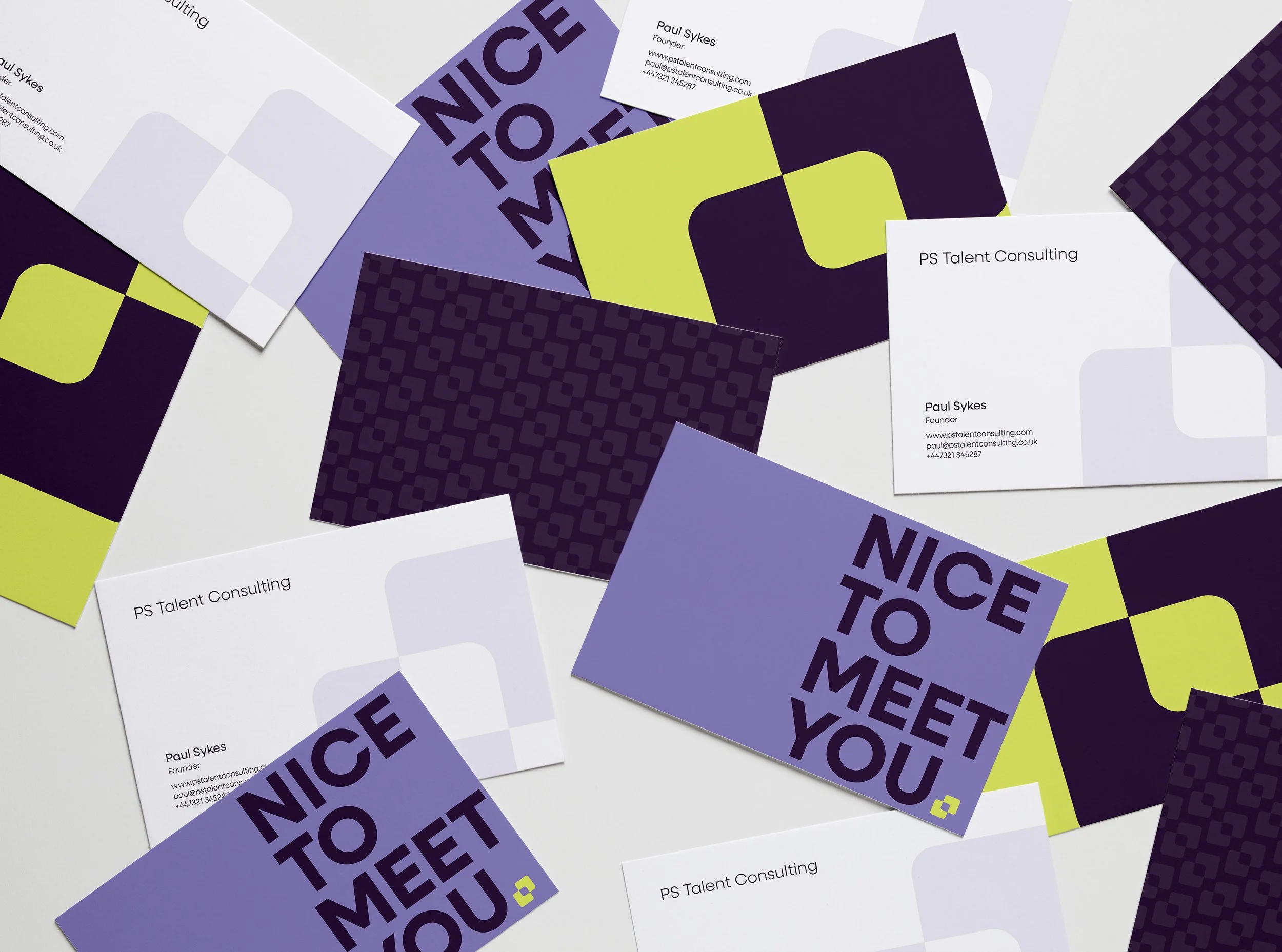
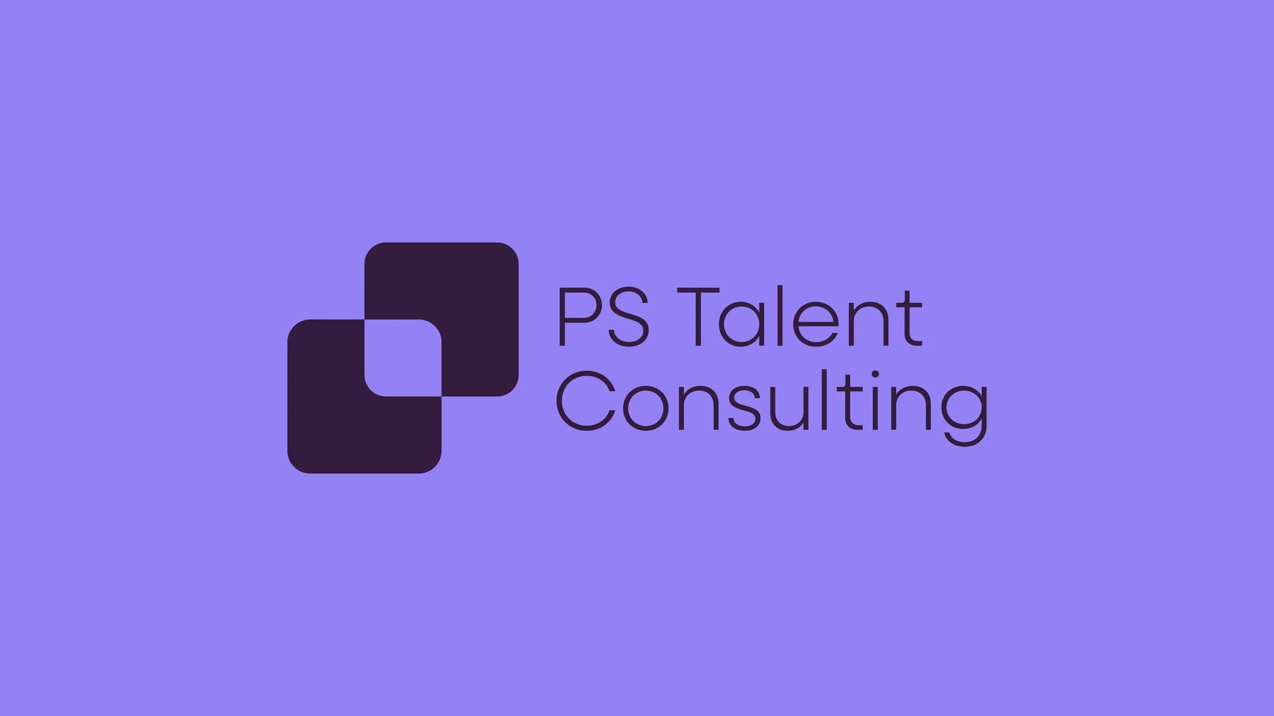
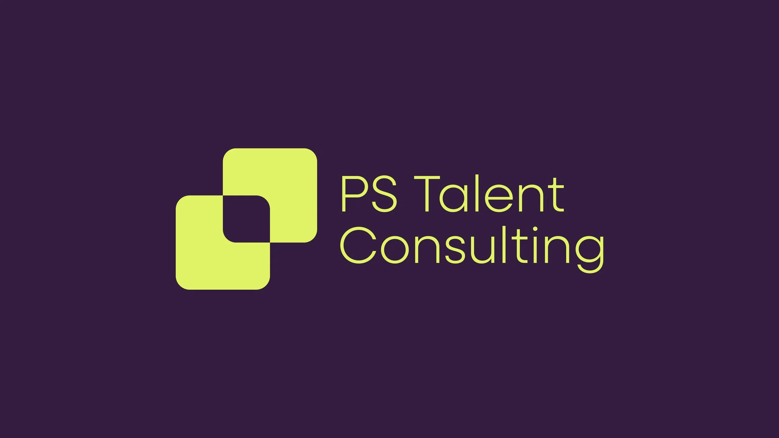
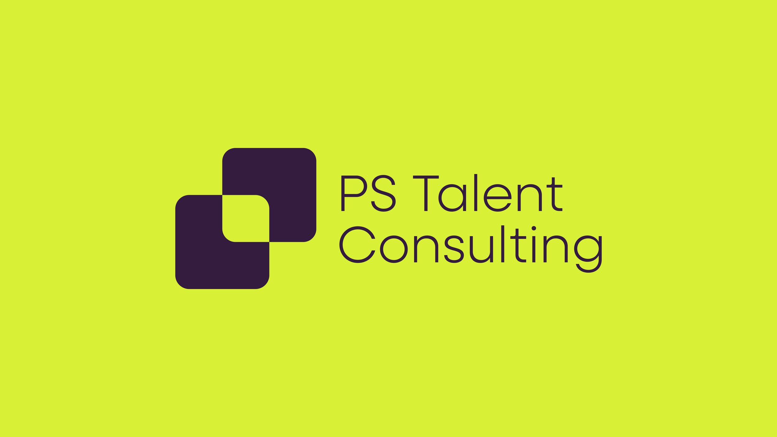
The concept centres around connection and progression. The logo is formed from two interlocking shapes, creating a subtle leaf motif that represents growth and new opportunities. At the same time, the form creates the letter “P,” adding a personal link to the founder and grounding the brand in its origins.
This interlocking structure reflects the relationship between candidate and employer, positioning PS Talent Consulting as the link that brings the right people together.

Approach
The colour palette was designed to feel both refined and distinctive. Deep plum provides a sense of trust and experience, while violet introduces energy and ambition. A lime accent adds contrast and signals moments of growth and opportunity.
Together, the identity balances professionalism with a more modern, human approach, positioning PS Talent Consulting as a confident and credible presence in the recruitment space.