Brand identity | Visual strategy
I developed a brand identity and digital product guide for a trading mentor, with the aim of creating a system that feels clear, professional, and accessible to a broad audience. The brand needed to balance the analytical nature of trading with a modern, approachable visual language that could support both beginners and more experienced traders.
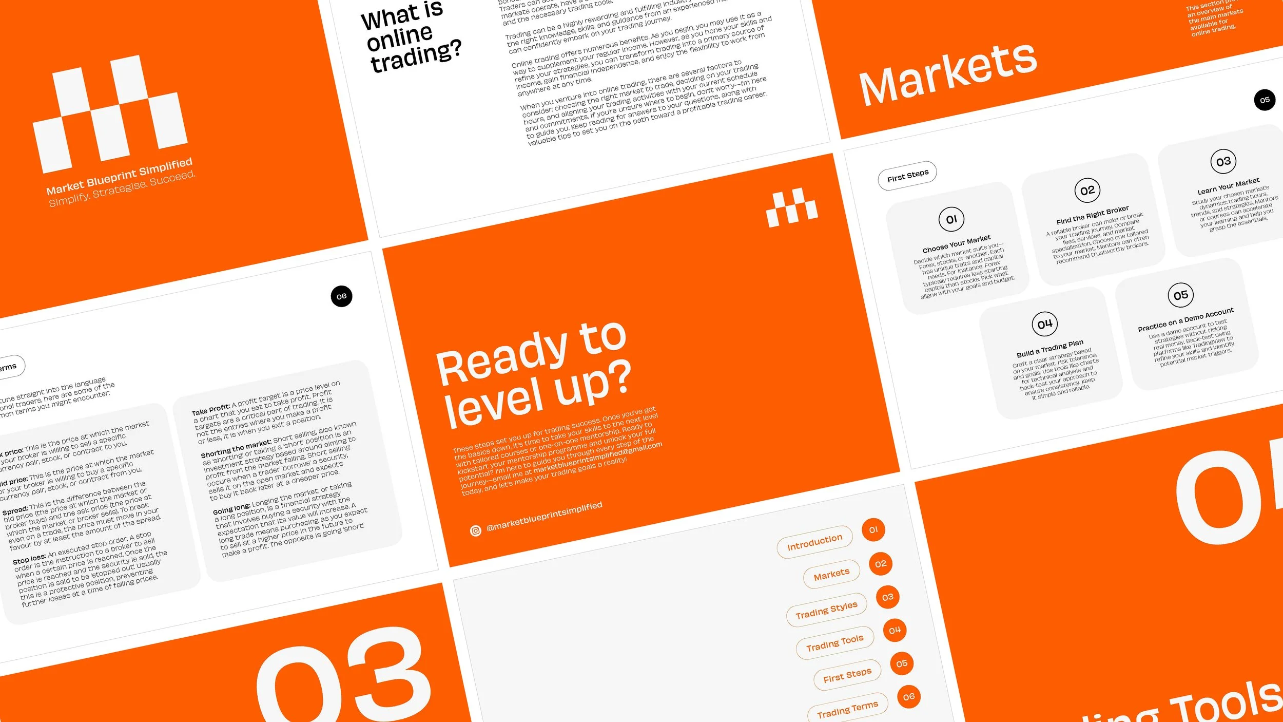
At the same time, the identity had to extend beyond branding alone, supporting the creation of an educational resource designed to introduce key trading concepts ahead of one-to-one mentorship sessions. The goal was to bring structure and clarity to a complex subject, while maintaining engagement through design.
Market Blueprint Simplified


Overview
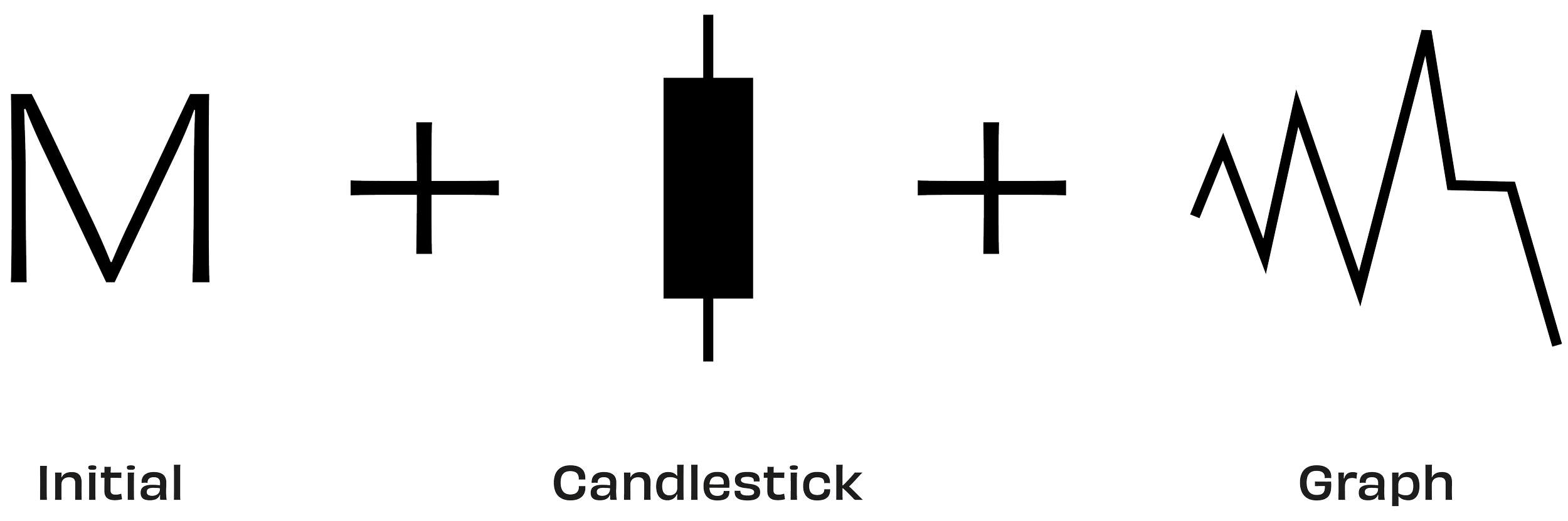
The identity is centred around the idea of simplification, translating complex financial concepts into a clear and recognisable visual system. The logomark forms the letter “M,” while subtly referencing core trading principles such as candlestick structures, market movement, and chart formations. These references are embedded in a way that feels considered rather than literal, reinforcing the analytical nature of trading without overwhelming the design.
Approach
The visual language draws directly from trading environments, incorporating references to charts, movement, and momentum. The mark itself suggests both structured data and upward market behaviour, alluding to patterns of growth and reversal within financial markets.
The colour palette is intentionally restrained, using black, off-white, and orange. Black conveys authority and precision, while off-white introduces clarity and balance. Orange is used as an accent, introducing energy and focus while referencing bullish movement within trading systems.